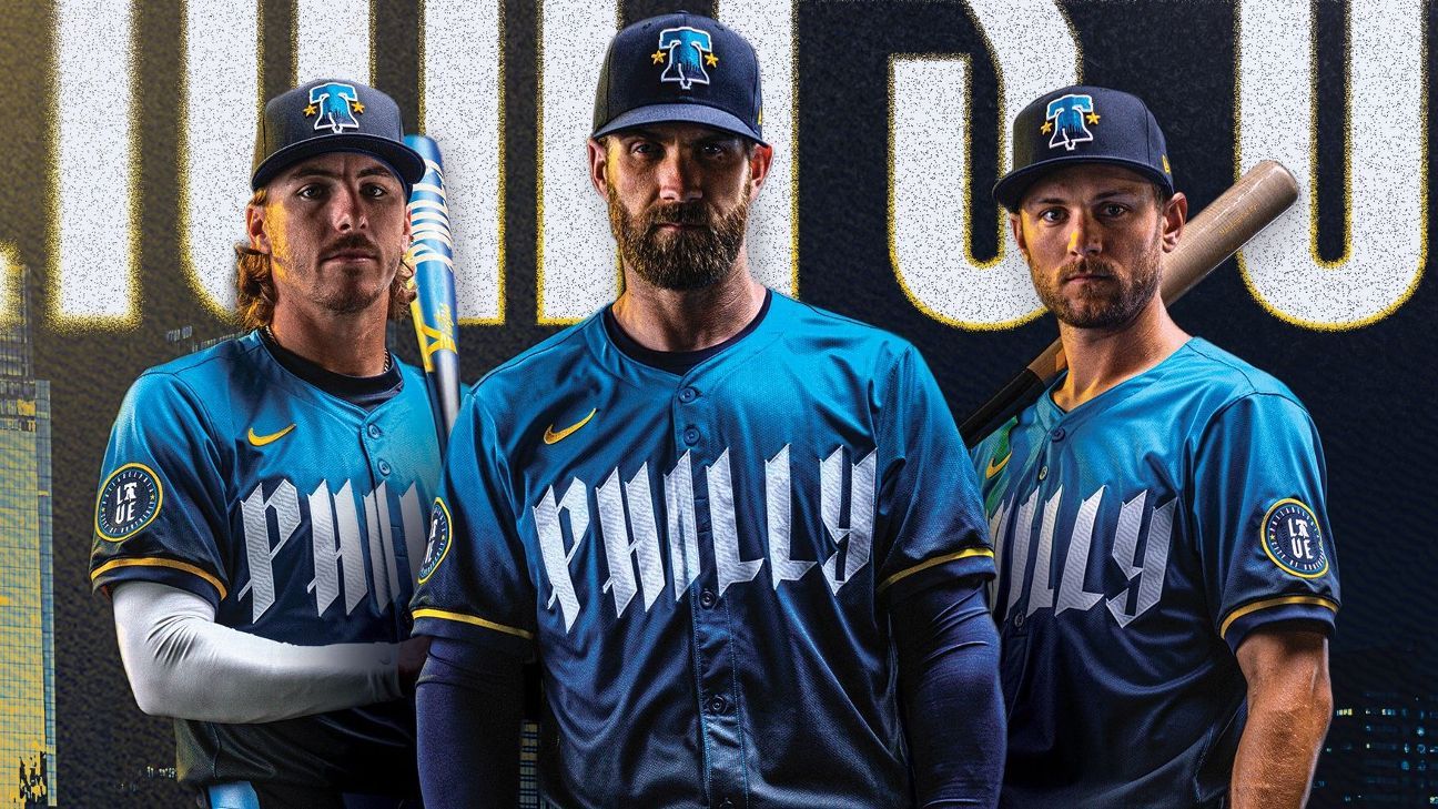
The Philadelphia Phillies unveiled their City Connect uniforms Friday — a modern look that’s intended to celebrate the city’s rich history, while appealing to a younger audience.
The reveal is the first in a line of nine Major League Baseball teams that will have a new City Connect uniform this season. It will debut on the field on April 12.
“We are excited and honored to be the first team this season to officially unveil our City Connect uniform, which features a new modern design that represents being ‘unapologetically Philly’ and celebrates our city’s rich history, ” said Phillies vice president of business affairs Howard Smith in a news release.
The structured process of the Phillies’ design began in 2021 with an emphasis on a look that is tailored to younger fans. The choice of when the uniforms will be worn on-field this season — every Friday home game — is specifically meant for days/times when more younger fans will be able to attend, Smith told ESPN.
“It’s about getting younger as a sport,” Smith said. “We’ve got a lot of 20-somethings in that clubhouse. So it’s kind of part of the target we’re going after, they’re sitting down in the clubhouse. And to see their excitement through the process was gratifying.”
The uniform includes multiple nods to Philadelphia’s roots, a key component of each City Connect uniform. The blue and yellow colors are directly related to the colors of the city’s flag, the oldest and only one that’s gone unchanged in the United States.
Philadelphia’s skyline is depicted on the inside of the uniform’s collar in a bright blue shade, meant to represent what Philadelphia is at its core — “a blue-collar big city with a small-town feel,” according to the news release.
The pattern of “Philly” across the chest is similar to text found on historical documents written in the city and includes a nod to the cracks within the Liberty Bell.
It wouldn’t be a Philadelphia uniform without paying homage to the “City of Brotherly Love” moniker, which appears as a sleeve patch integrated with the word “Love.” There’s an etching pattern on the interior referencing the illustration from literature common around the time of the revolution. Baseball laces are also woven in this detail with the intention of representing the Phillies’ place in the city’s DNA.
According to Smith, John Middleton, the principal owner of the Phillies, was very direct that the process had to be organizationally driven and was important that everyone was on the same page with the design. First and foremost, the players — some of whom were involved in the process — had to like the direction.
“We started with the clubhouse and showed them the designs and [it was] very, very well received,” Smith said.
Smith described the look as “sort of like a mini history lesson.”
“Given the fact that we got to go in Year 3 [of the City Connect series] and see how some of the really successful clubs did it, both in the NBA and Major League Baseball, we knew that just rolling out another red, white and blue jersey wasn’t the answer,” he said. “It had to be distinctive, it had to be different and it had to stand for something and there had to be, like I said, there had to be that connectivity.”


